Milford

xrayspx's picture

Today In Donuts Annoying Me News

Music: 

Blur - Coffee and TV

For a couple years now, I've been telling Natalie that if I had a couple bucks and an inclination to build a thing or interact with people, I'd Do It Right. I'd make fresh donuts daily. If I worked at Red Arrow, I'd make the case that the absurd Milford, NH third shift should dedicate themselves to making bread for the rest of the day. Instead, they recently discontinued that shift.

So in that vein... I have a lot of music videos. To go with them, I've downloaded a bunch of '80s commercials for Nostalgia's Sake. Things like cereal, BMX bikes, Underoos, Schoolhouse Rock, and since you can guess I'm from the Boston market, Spags and Dunkin' Donuts.

At Spags, they'll save you money:

These old commercials, pre and post Fred, all tout the freshness of their product. It's the "Freshest you can buy". Then they stopped making donuts on site. There is no longer a fryer in the building at this point. I guess they nuke or salamander their croissant, bagel or muffin sandwich and formed eggs, I dunno they do something to make them hot, but none of this stuff could be mistaken for "fresh".

Sadly, I imagine that by and large, they were right. They /are/ the freshest donuts most people can get. Their 1980, Pre-Fred accusations that "most super markets donuts are made by machine" actually came about in my store in around 1994 or 1995. The day the woman* who fried and filled and decorated the donuts every day moved to Heath and Beauty Aids, which was coincidentally the day before /I/ learned to "make" donuts and muffins.

Muffins were from mix, + any other stuff like frozen blueberries, cinnamon apple chunks or cranberries or whatever else we'd mix in. Muffins were easy, but donuts were even easier. They came in frozen now, so all we did was heat 'em up, glaze them and put them out. We still glazed, filled, sugared, dipped them by hand, and the "baking" process wasn't that bad, they tasted fine, i guess. I never really ate them much. You tend not to want to eat muffins if you're covered in muffin mix for 5 hours every day. Now that I think of it, even though we were frying donuts daily, there's no way that wasn't just frozen dough that we bought in. Don't get the impression these were scratch-made, just rolled and fried on site. When I stopped making donuts and muffins, we had transitioned away form even making the muffins from mix, they now came in as frozen batter in muffin cups and plastic trays. We'd just move them to metal trays, bake 'em and serve 'em up. That was probably '95 or so at the latest.

The couple of times I've gone into Dunkin's (as it's now trying to rebrand itself officially) in the last 2 decades, I've come away with the impression that they don't even do that much anymore. I don't see that there's even room for a table to glaze and decorate anymore. Do donuts just come in all pre-filled and room temperature ready to put out? Like the Krispy Kremes at the convenience store?

There is still a good donut place in our town, but I imagine even they aren't actually scratch-making anything. It's just fresher than Dunkin's. Meanwhile I'm pretty sure the baker my parents went to in the '70s and '80s hand-made everything in his shop from scratch from donuts to birthday cakes.

* - Hey Millennials, here's some trivia: I remember the woman who made the donuts was about 23 or 24, and that she and her husband, who drove forklift as I recall, and with whom she owned a house, had managed to save enough in their water jug full of change to go on vacation in the Caribbean. Just sayin'.

xrayspx's picture

Antique Desk And Its Dazor Task Lamp

Music: 

This just made me unreasonably happy today, so I am gonna have to share it.

A couple of years ago we found an antique drafting table for pretty cheap money at a local shop, I think we maybe paid $200 or so for it. It had been used and taken very good care of for...80 years? Maybe more? It had a Kilroy on it. So we snatched it and replaced Natalie's less beautiful portable drafting table with it. It's a real monster, like 48" x 36", and great shape, well built, though it does have quite a twist to it. It'll last Natalie forever.

Since then, one problem she's had was getting an adequate task light. She had a plastic fluorescent arm-light, but it was nowhere near long enough to cover the new desk. And, you know face it, it looked like junk.

So the other day we were in another local consignment shop and I spotted a monster arm-light for $25. Natalie didn't like the look of the fact that it was fluorescent (will we be able to get bulbs...) and wasn't sure about the mount, since it didn't clamp, it looked like it screws to the desk. As is my way, I needled her for a couple days and let it work on her that she needed to check it out. No one's gonna stop making fluorescent bulbs, and even if they do, so we get an LED adapter, or just rewire it all the way to the plug for LED. Today she went back and grabbed it, and score, it was on sale, now $18.

We hadn't really looked at it, but turns out it's a Dazor from 1950. As we were trying to figure out how this was supposed to attach (none of the hardware was there), I figured we could get a couple of set screws with wingnuts and big ass washers, drill the desk (Natalie was not a fan), and just bolt it in.

So she started measuring up the distance between the screws, and found that they exactly matched the existing holes someone had already drilled in the desk. We were just re-uniting the drafting table with it's long-lost lamp!

The table top had to be turned around so the holes were at the back, so that was an hour well spent, but it all lined up and she dropped right in. Now it's at that point that I thought it was too cool and started writing this post. However, interesting bit of trivia, Dazor was founded by Harry Dazey, of the Dazey Churn and Manufacturing company in St. Louis. We happen to have a good-size collection of Dazey ice crushers, a can opener, and one of what's probably a small handful of portable stands that are left in existence. This makes Natalie super happy, because we've completed the Dazey set finally.

So here we are, desk, lamp, and ice crusher:

The thing that impresses me the most about this is that in the spare parts section on Dazor's site they list all the various switches and ballasts so you can repair your lamps. Not only are ours still fully in stock, but they've only got 7 listed switches and 5 ballasts, which I'm sure cover virtually every product they've ever made. Simplicity and rugged construction = happy customers forever.

Not only were these lamps built to outlive your granddad, and they did, obviously, but you can still get parts for 'em if they ever do let the magic smoke out! Right from the manufacturer. Try that with literally any other product, especially now. Man. I mean, I get that if you make a lamp, and that lamp lasts forever, then you never sell another one to that customer, and your company dies. But the other side of that coin is that you end up the standard in task lighting, forever, with multi-generational product loyalty.

We'll probably end up buying brand new Dazor lamps for spaces like our office workbench once it's built, and I fully expect them to last just as well as this one clearly has.

xrayspx's picture

Kitchen Designs

Music: 

Van Halen - Panama

As anyone who reads Natalie's site, or who has been around either of us for more than five minutes in the last six months will know, we've been in the middle of a kitchen renovation for...way, way too long now. Since I did the actual layout design (twice) Natalie asked that I write up how that process went and how we progressed from the original layout, through to what we've got now.

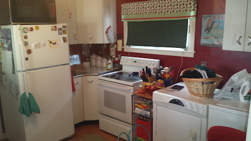
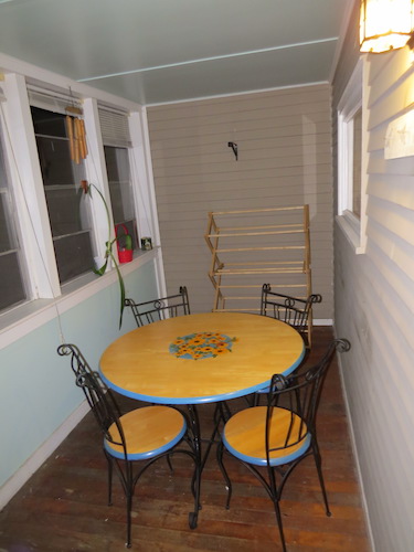
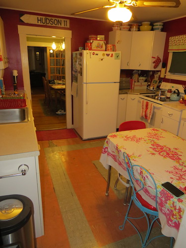
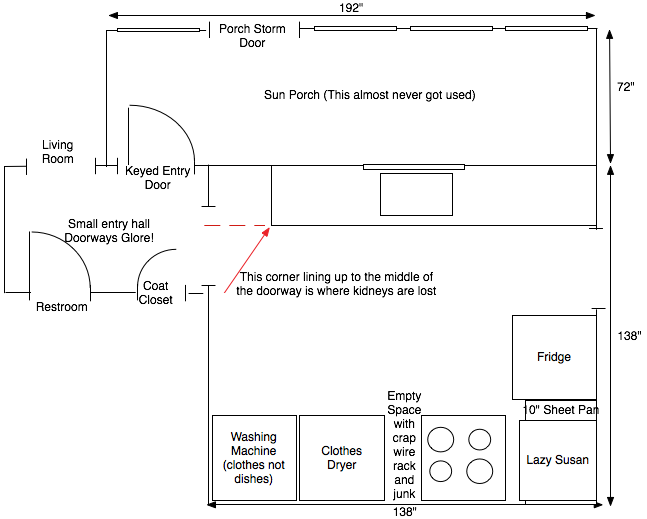
The original kitchen layout was less than ideal in many key ways. It was basically a galley kitchen which acted as a footpath from a hallway at one end where there was an external door, a restroom, and our living room through to the dining room and the main part of the house (office, library, bedrooms). This split the workflow of the kitchen between the "sink side" where the doors were and the "stove side". In amongst that were afterthoughts like "oh hey someone should put a fridge here" or "who wants a laundromat?". It wasn't great.

One of the biggest problems was that these two opposing doors weren't lined up. The dining room side door was a good 30" from the wall, which gave enough space for the countertop, even though the end of the counter did intrude into the door trim an inch or so. The other door however was maybe 20" or so from the wall, meaning that if you ran countertop right to the end of the room, you'd be intruding 5" or so into the door opening.

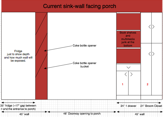
This is illustrated in this rough sketch of the beginning state and a couple of photos:
Since my imagination is limited, I originally planned our new layout based on the layout as we had it here. This means that to get to the (newly finished) breakfast and laundry area one would go out that hallway-side door, then out what used to be the exterior door into what used to be the porch to eat breakfast or wash clothes.

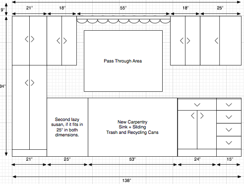
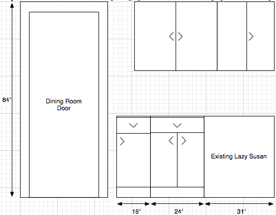
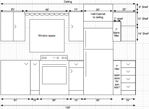
Thus the new design ended up looking like this, around three walls, with the left-hand side wall still being entirely blank, since there was a fridge and doorway there. We figured we'd put posters there like we had in the past:

Sink Side (top of the above image):
Dining Room Side:
"Stove Side":
You get a sense for how conventional my thinking was, to the point of comically over-engineering to try and shoehorn as much crap as we could in the same space. The awkward doorway was rather elegantly handled by the fact that that tall-ass broom closet (21" wide full-height cabinet in the diagram) is only 15" deep, so it would give nearly two feet between the door and where that lazy susan, with its 45 degree angled door would "guide" you into the room, helpfully saving the reproductive organs of any guy who staggers through that door without really looking.

But what a mess. Take the refrigerator. We knew that any fridge we bought in the Shiny New Future was going to be much wider than the 29.5" GE Home Depot special we had, so I had to plan for that with spacers that could be removed, or custom cabinetry that could be ripped out when we bought a new one. And all the cramming in of bookshelf space wherever we could fit it. And that half-height cabinet above the fridge slammed all the way to the ceiling, ugh. It was just forced.

At some point around the fourth or fifth sink we decided on, I could no longer shoehorn it into this design. We were wavering between a fully integrated Elkay with a built in steel backsplash and countertop, and the one we ultimately got, which is a more conventional, but still huge (FIFTY FOUR INCHES FUCK YEAH!) drop-in with left and right side drainboards. This simply blew my model all to hell. I spent a few days in Omnigraffle screwing around to make space for that full-countertop monster. At a basic level the problem was that the full steel countertop sink had to line up directly to the edge of a Youngstown cabinet on both sides, since it couldn't really overhang them. Everything under that sink would then need to be custom carpentry.

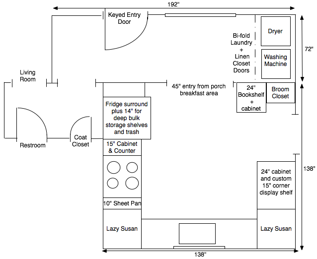
I had to find a third way. So I completely changed my outlook. That doorway is annoying me and is going to cause me to lose a testicle? GET RID OF THE DOORWAY. We're taking the thing down to studs anyway. Put the fridge there, where it will be convenient and out of the way. Let's make a huge (45 inch) entryway from that breakfast area, which will also let light flood in from the massive window out there.

So what we ended up with is a far superior layout both for foot traffic flow, and for kitchen workflow. We changed the layout from a "Galley" style kitchen to a more traditional 3-sided model with entrances to the breakfast area on one side and the dining room on the other. It adds a slight zig-zag to get to the living room & restroom, but it's really, really minimal.

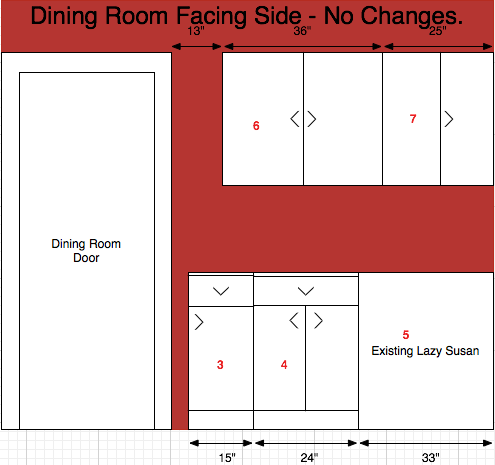
That plan looks more like this, with the walls in the same order, starting at what used to be the sink area.

Here's the top-down:
Dining-room facing:
Sink wall:
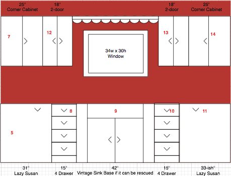
As you can see, we /did/ save the front of that sink:

Stove wall:
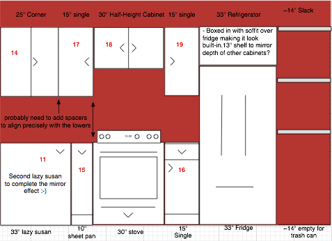
As you can see from the photos, our contractor and his subs have done a phenomenal job of executing this design. It's exactly as we envisioned it from day one, and we couldn't be happier with their work. Stay tuned for the "Complete" complete photos which I'm sure will be coming shortly on Natalie's site.

Throughout this process Natalie and I have had slightly different goals. She wants the Ultimate Vintage Kitchen, which, I think we can all agree on, has been achieved. I wanted to see how close I could get to having a professional quality and ergonomically correct and functional space. I think we've ultimately achieved that as well with an industrial quality sink and faucet fixture, but which fit perfectly into the retro aesthetic we wanted. It just took a mental break on my part to force the pieces together.

If anyone needs them, I'll update when I've posted the set of Omnigraffle stencils I whacked up to fit all this stuff together. They are proportionally correct to each other, and there are some in the stencils which didn't ultimately make it into the room, since they are "cabinets we own", but we just couldn't jam any more crap in there :-) If anyone can figure out a good way to represent these crazy corner cabinets and lazy susans in 2D I would very much appreciate your input. It's not like I live with a goddamn graphic designer or anything.

xrayspx's picture

2016 Third Party Voters

Music: 

In 2016, a vote for a third party is a vote to legitimize Trump's fascist vision.

As I sit here watching a Donald Trump rally, and my fellow Granite Staters chanting "Build That Wall" while a stream of consciousness volley of nonsense, lies and unconstitutional threats comes out of this horrible man, I'm reminded of exactly how close the race is here in New Hampshire.

Far from being utterly repudiated, we're looking at fairly even poll numbers in New Hampshire. Think about that.

Fixed Tags:
xrayspx's picture

Blowing Minds With Natalie

Music: 

Elvis Costello - No Action

We are ramping up to Viva Las Vegas 18, and Natalie has really killed this outfit. She made and then painted this skirt of the neon signs of old Vegas:

Thu, 03/26/2015 - 7:51pm - Natalie painted this awesome skirt for our trip to Viva Las Vegas 18 next week!                               csFlickr

Thu, 03/26/2015 - 7:29pm - Natalie painted this awesome skirt for our trip to Viva Las Vegas 18 next week! csFlickr

Thu, 03/26/2015 - 7:28pm - Natalie painted this awesome skirt for our trip to Viva Las Vegas 18 next week! csFlickr

And, at the last minute, her brother came through with this TV prop jacket:

Fri, 03/27/2015 - 10:28am - Cherry tears cndFlickr

Updated:
Thu, 03/26/2015 - 7:26pm - The jacket. cndFlickr

xrayspx's picture

Wildlife

Music: 

A few minutes ago Natalie got all panicky and had me come running to see these deer hanging out in my neighbor's driveway. They were just poking around until some dog barked a block away and they moved off into the woods. They were obviously keeping an eye on me, but not taking off because of us.

Fixed Tags:
xrayspx's picture

TV Cabinet

Music: 

Curtis Mayfield - Superfly

Last winter we had some of our barn renovated into a new living room. Natalie has gone crazy with the retro look in here, and we just put in the second-to-last piece, a good looking spot for the TV (I'm still nagging her to just drop the hammer on an Eames lounge...).

We had been looking for a while for a '60s hi-fi console, but she found them too big, and they're really not deep enough to fit things like computers and large receivers. My requirements were 18" for the PC to fit comfortably, for instance. At one point I told her to give up on those, and just look for dressers that matched the depth requirement, here's what she found, for $55:

For reasons that aren't entirely clear to me, I decided that Step One was to rip the pressed board back off. We still have it, and it should honestly probably go back on with appropriate holes drilled. I really don't remember what I was thinking.

Anyway, we shimmed the drawer holes so things would fit flat without taking out the drawer track. The goal was to do as little damage to this thing as possible, just in the case we want to use it as a dresser, or re-sell it or whatever later. None of those things are going to happen. Here's that interim state:

And a wider view of how it fits in the room:

To cover the holes I had suggested some cool amp grille cloth fabric, but we actually had some pretty good stuff on-hand. It also has the advantage of not having a really tight pattern, so if it's stretched more in parts, you can't tell. The grilles are then held on by cabinet magnets. So the extent of the modification of the dresser is 12 screws to hold the metal plates the magnets stick to:

Done:

I may take some black cloth and add it to the inside, just to block 100% of the LED light when all the room-lights are off, but with the lights on, you can't see anything.

xrayspx's picture

Good Utility

Music: 

Natalie handed me this letter from PSNH last night. I had expected it to say something to the effect of "thank you for paying for all of our kids to go to college by installing baseboard electric". It started off mentioning something about snow.

I had my moment of: "OH AND YOU GUYS CAN GO FU... hey, this is nice", and so I share it:

Fixed Tags:
xrayspx's picture

It Was The D&D Of Food

Music: 

Talking Heads - Once In A Lifetime

Tue, 01/01/2008 - 12:01pm - We picked 12lb of plums from one of our two plum trees this week.  We'll have jam, crumble, vodka/plum-stuff, and just like, normal casual eating plums.

Part of this blog entry on a food trade I made for some bitter melon:
www.xrayspx.com/it-was-dd-food csFlickr Some time ago, one of my cow orkers sent me home with some Chinese bitter melon in trade for some of our plums. Natalie fell in love with it immediately, but I can't really get past just how strong it is. I was knocking it down with hot sauce, as I do.

Yesterday I showed up and what do you know? Three more bitter melons ready for me to take home, including one /monster/ of the species which just couldn't have been natural. Fortunately I found the answer at a farm stand tonight. They had bhut jolokia (improperly "ghost chili") peppers.

This was like two titans doing battle on my tongue! I'm fine with the heat of the jolokia by now, but what I love from it is the powerful fruity, citrusy flavor that just crushes you when you put it in your mouth, before it even touches your tongue. It pretty much perfectly set off the bitter melon.

I must have eaten 1.5lb of stir fry and my mouth is very very happy with me.

Fixed Tags:
xrayspx's picture

Visit Your Drive-IN

Music: 

Milford has a great drive-in theater, it's in the middle of a corn field and everything. It's perfect. But in the ten years we've lived here we've only gone twice, since most movies suck. I remember we saw the Johnny Depp Charlie & The Chocolate Factory, with Fantastic Four, and we saw Snakes on a Plane with Talladega Nights (which is terrible). Natalie got to see a Harry Potter movie with some of our friends while I was out of town. The problem is that most movies suck, and we have no interest in comic book movies or live action cartoon remakes, which are the only things coming out now which are worthy of a drive in. (I would go see a Spider Man or Batman movie there I guess. I'm mainly thinking of Transformers movies and Iron Man movies).

A few weeks ago we were driving by and I said to Natalie "You know what they ought to do? They ought to show movies from the '70s and '80s, those movies were awesome and people would come watch them. I'm going to write a letter dammit. We were home 6 minutes later, I forgot about the letter.

Somehow they got the message. Tonight we watched Back to the Future and Jaws! We just happened to be driving by like 1 hour before the sun was down and Natalie saw the sign and we scrambled all fighters and made the snap judgment that we had to go do this. It's always a great time, eating concession stand food and supporting a wonderful local business in an industry that needs it.

The best thing was actually all the kids watching BTTF and loving the shit out of that movie. It lacks all the modern indicators of a blockbuster. No anthropomorphic animals, no animation, no CGI, no Michael Bay. But those kids all went nuts when George McFly punched out Biff. After the movie a parent was explaining that Marty was Michael J Fox, and I felt old.

Milford Drive-In has already made the leap to digital projection which is proving to be a hurdle that threatens to put many drive ins out of business. I'm glad they've been able to make that move and will be here for years to come.

So yeah, go watch movies, they close next weekend, and because of the unique way in which their website is designed and managed, I can't tell you what those movies will be. I believe the most reliable way to find out is probably to drive by the sign and look at it. Go give 'em your money, it's always worth it.

Fixed Tags:

Pages

Subscribe to RSS - Milford