This just made me unreasonably happy today, so I am gonna have to share it.
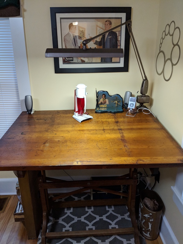
A couple of years ago we found an antique drafting table for pretty cheap money at a local shop, I think we maybe paid $200 or so for it. It had been used and taken very good care of for...80 years? Maybe more? It had a Kilroy on it. So we snatched it and replaced Natalie's less beautiful portable drafting table with it. It's a real monster, like 48" x 36", and great shape, well built, though it does have quite a twist to it. It'll last Natalie forever.
Since then, one problem she's had was getting an adequate task light. She had a plastic fluorescent arm-light, but it was nowhere near long enough to cover the new desk. And, you know face it, it looked like junk.
So the other day we were in another local consignment shop and I spotted a monster arm-light for $25. Natalie didn't like the look of the fact that it was fluorescent (will we be able to get bulbs...) and wasn't sure about the mount, since it didn't clamp, it looked like it screws to the desk. As is my way, I needled her for a couple days and let it work on her that she needed to check it out. No one's gonna stop making fluorescent bulbs, and even if they do, so we get an LED adapter, or just rewire it all the way to the plug for LED. Today she went back and grabbed it, and score, it was on sale, now $18.
We hadn't really looked at it, but turns out it's a Dazor from 1950. As we were trying to figure out how this was supposed to attach (none of the hardware was there), I figured we could get a couple of set screws with wingnuts and big ass washers, drill the desk (Natalie was not a fan), and just bolt it in.
So she started measuring up the distance between the screws, and found that they exactly matched the existing holes someone had already drilled in the desk. We were just re-uniting the drafting table with it's long-lost lamp!
The table top had to be turned around so the holes were at the back, so that was an hour well spent, but it all lined up and she dropped right in. Now it's at that point that I thought it was too cool and started writing this post. However, interesting bit of trivia, Dazor was founded by Harry Dazey, of the Dazey Churn and Manufacturing company in St. Louis. We happen to have a good-size collection of Dazey ice crushers, a can opener, and one of what's probably a small handful of portable stands that are left in existence. This makes Natalie super happy, because we've completed the Dazey set finally.
So here we are, desk, lamp, and ice crusher:

The thing that impresses me the most about this is that in the spare parts section on Dazor's site they list all the various switches and ballasts so you can repair your lamps. Not only are ours still fully in stock, but they've only got 7 listed switches and 5 ballasts, which I'm sure cover virtually every product they've ever made. Simplicity and rugged construction = happy customers forever.
Not only were these lamps built to outlive your granddad, and they did, obviously, but you can still get parts for 'em if they ever do let the magic smoke out! Right from the manufacturer. Try that with literally any other product, especially now. Man. I mean, I get that if you make a lamp, and that lamp lasts forever, then you never sell another one to that customer, and your company dies. But the other side of that coin is that you end up the standard in task lighting, forever, with multi-generational product loyalty.
We'll probably end up buying brand new Dazor lamps for spaces like our office workbench once it's built, and I fully expect them to last just as well as this one clearly has.